Your work, front and centre.
Showcase
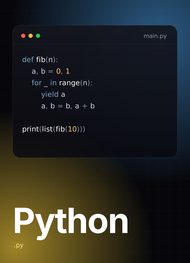
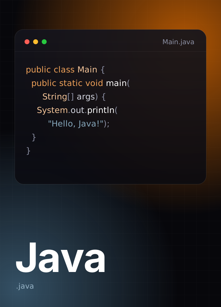
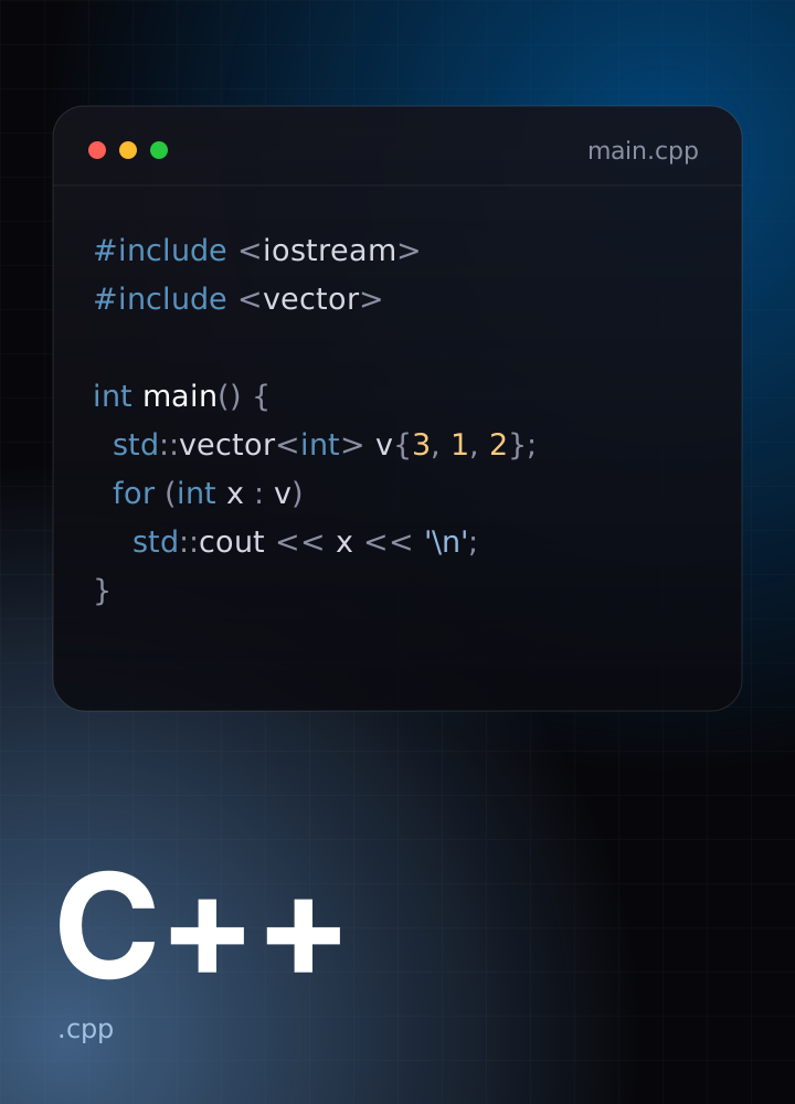
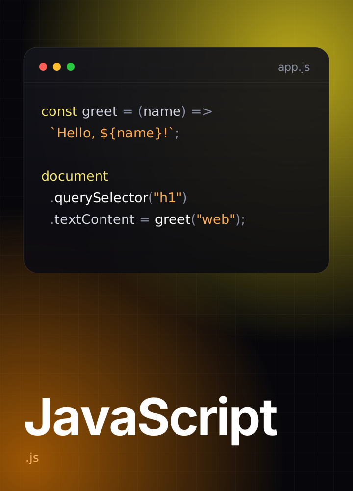
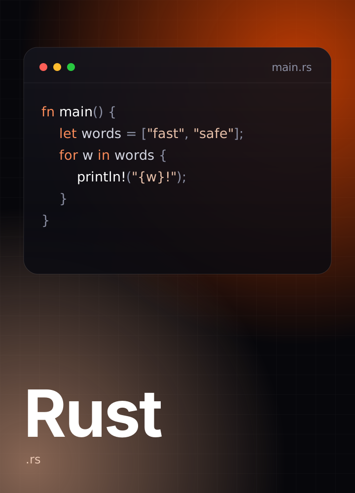
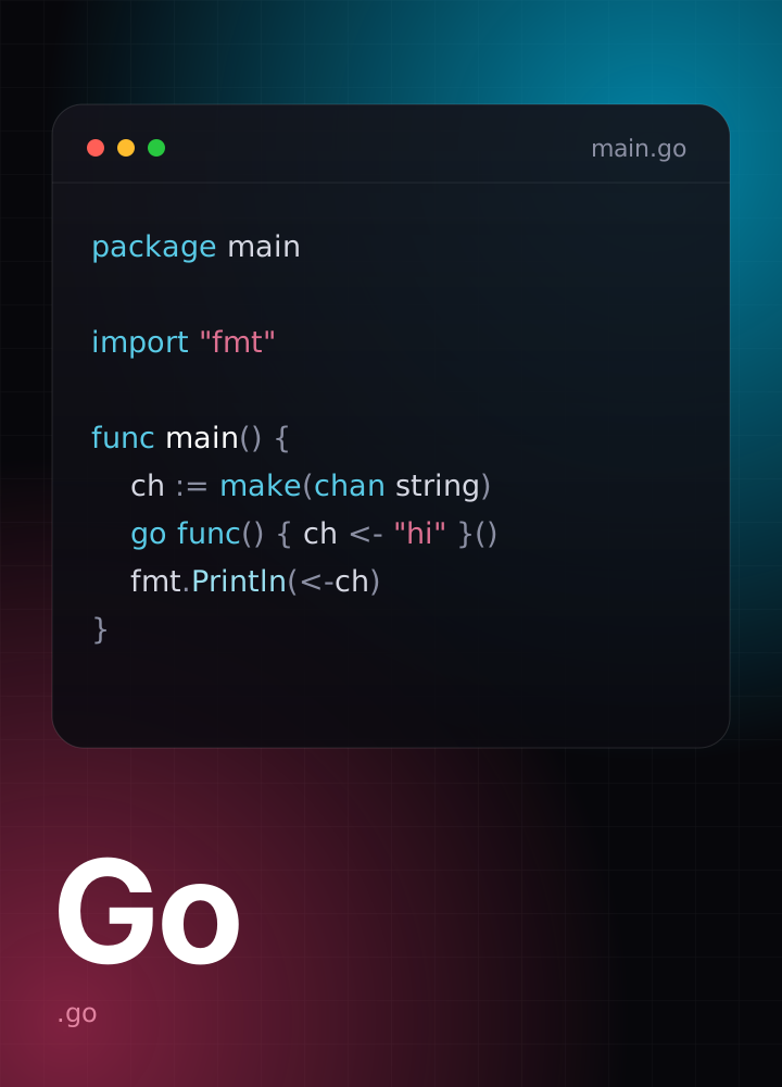
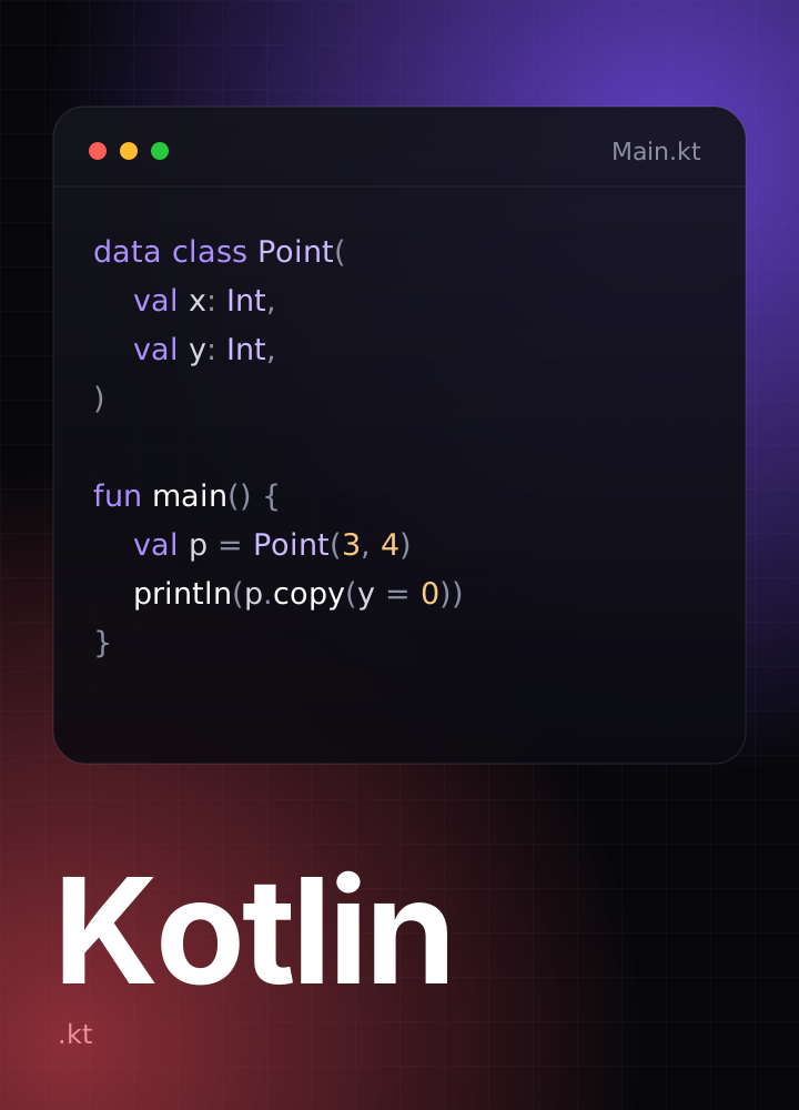
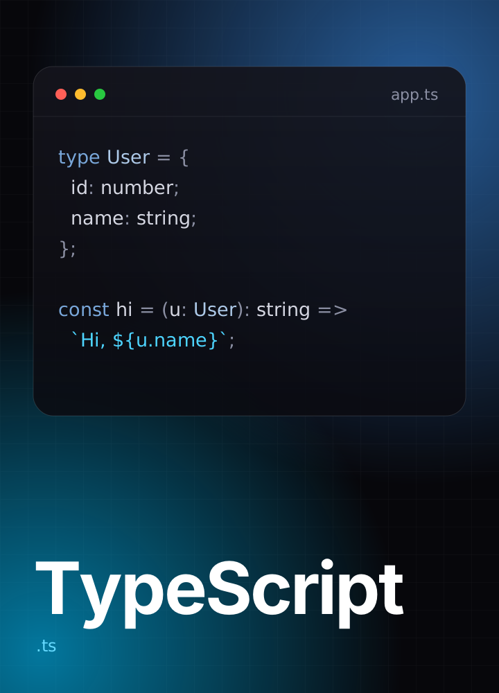
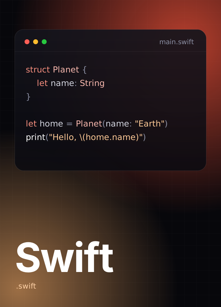
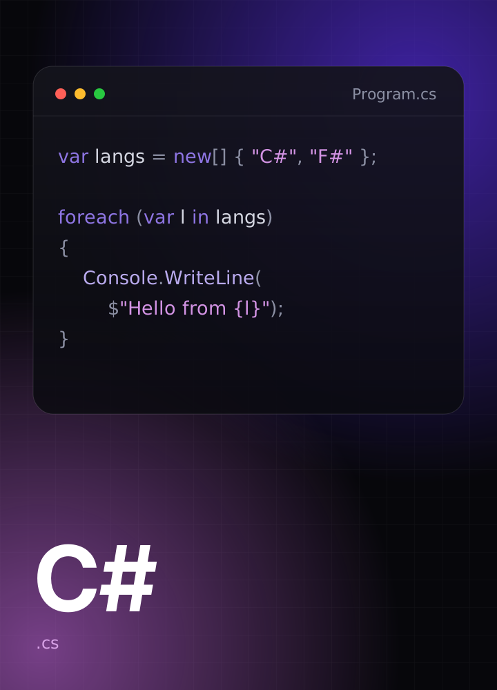
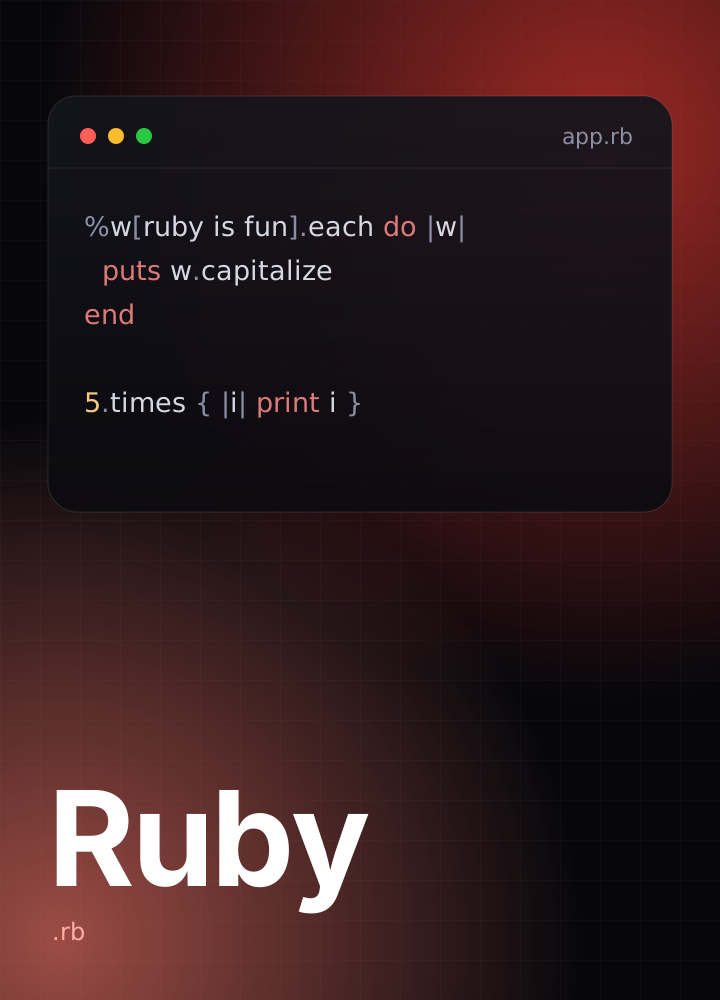
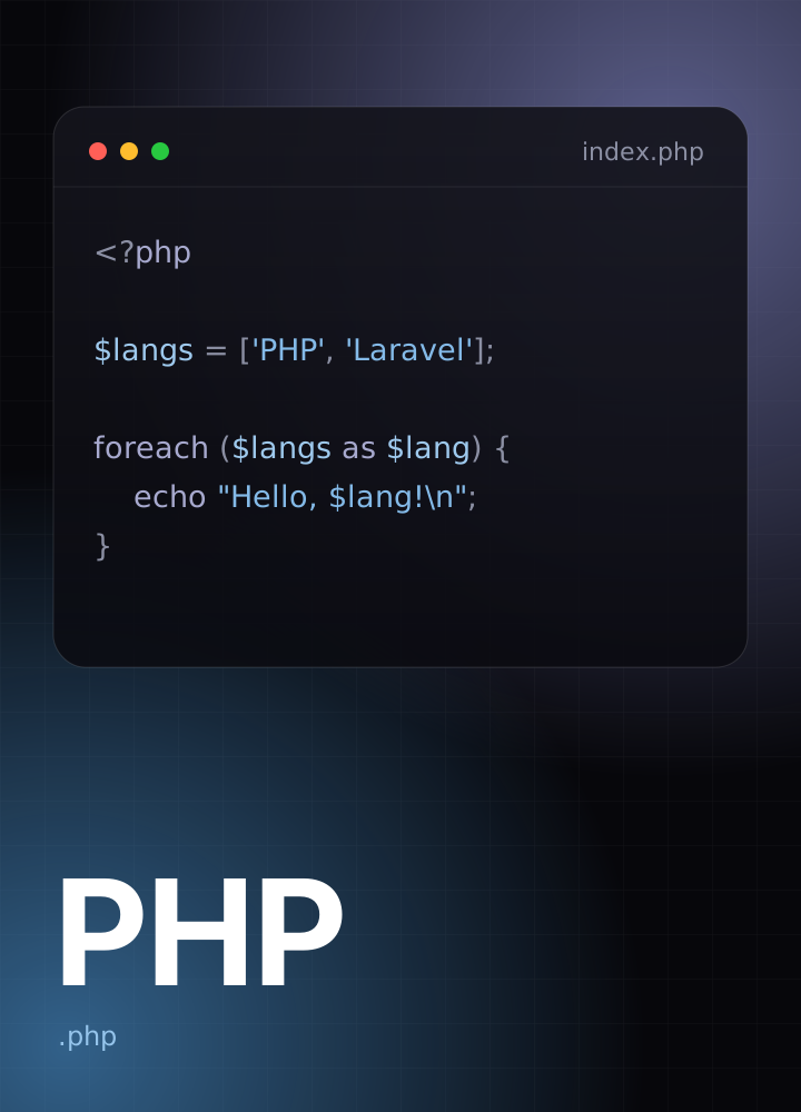
- Pure CSS 3DNo WebGL, no animation library
- Any widthSized in container units
- Calm by defaultFreezes under reduced motion
Features
Everything the hero needs. Nothing it doesn't.
One component does the heavy lifting; the rest of the kit stays out of its way.
Images lead
Your work streams toward the viewer on two mirrored rails, so the hero shows instead of tells.
Pure CSS motion
One set of generated keyframes drives every card. Nothing to load, nothing running on the main thread.
Fits any width
Every length is in container units, so the corridor keeps its shape from a phone to an ultrawide.
Respects reduced motion
With reduced motion on, the corridor pauses as a finished still instead of collapsing.
Built on shadcn/ui
Next.js, TypeScript, Tailwind CSS v4 and shadcn/ui — copy the components straight into your project.
Auth screens included
Sign-in and sign-up pages share the same look, with inline validation and a show-password toggle.
How it works
Three steps from a folder of images to a finished hero.
The corridor is a single client component with sensible defaults.
Bring your images
Pass any list of image URLs. If there are fewer images than cards, they simply repeat.
Tune the corridor
Adjust cards, speed and axis, or override the path geometry. Everything scales with the container.
Put your copy on top
Anything you pass as children renders above the corridor — headline, buttons, whatever the page needs.
<ImageStreamHero
  images={images}
  cards={9}
  speed={18}
  className="h-[560px]"
>
  <YourHeadline />
</ImageStreamHero>
Put your work front and centre.
Create an account and start from a hero that already looks finished.